
Prologue
User Profile and Brief
Before delving into this UX case study, it's important to clarify that this project was a personal endeavor pursued during my leisure time while enrolled in the "User Experience Design Essentials - Adobe XD UI UX Design" course on Udemy. This comprehensive course not only equips students with the fundamentals of the User Experience (UX) process but also imparts valuable skills in utilizing Adobe XD as a versatile UI design and prototyping tool. The course comprises two distinct projects, one of which is this self-guided endeavor. Throughout the project's timeline, the course's resources and materials, including a project brief and a persona brief, provided invaluable guidance and support when needed.
The project’s brief and requirements are as followed:
-
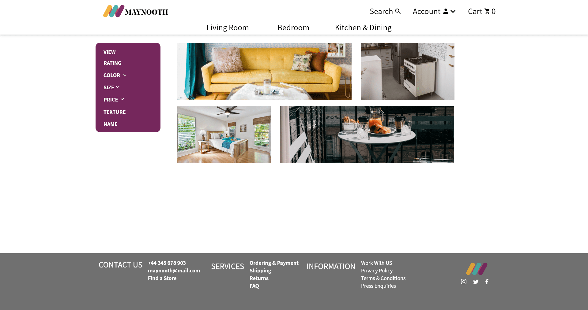
The project’s client is Maynooth Furniture. A furniture seller who is looking to have an e-commerce site built for them.
-
The brief includes a feature list of required pages and content within them. It also includes a list of two competitors to Maynooth furniture, habitat.co.uk and made.com.
The project’s targeted user/persona is detailed here:
-
Katherine is an executive at the local offices of an international medical device company. She earns a salary of $110,000 per year. She has children at University. She is both style & price conscious. Katherine is updating the furniture at the 4-bedroom family home. The update in furniture is following the slow remodeling of the house now that her kids have left for university. She loves to browse style guides online. She uses Pinterest to gather her design ideas.
-
So quick review: Our targeted user is an affluent, successful woman whose children are now adults. She is looking to re-furnish her house since her kids are now away at college. She is price and style conscious. She likes to create Pinterest style boards that help her with inspiration for shopping ideas.
As this project was a mandatory component of an online course, my goal was to meticulously navigate the process of crafting a distinctive user experience tailored to the designated persona. However, it presented a set of distinctive challenges in its own right.
Discover
Identify Needs
Despite having the project requirements clearly outlined in the initial brief, I found myself in the position of needing to acquire proficiency in Adobe XD from scratch. Fortunately, my prior experience with Adobe Suite products, notably Illustrator and Photoshop, facilitated a relatively swift learning curve. Additionally, my background in front-end development languages proved to be an asset in comprehending how to structure my page layouts effectively. These prerequisites set the stage for my research phase in this project.
Research
Compare Competitors, Identify Faults, and Find a Real-Life User Profile
Throughout the course, I embarked on a multifaceted journey encompassing mid-fidelity wireframing, prototyping, font and color selection, optional logo customization for Maynooth, mood board creation, and the development of a full-color desktop mock-up. As my proficiency in Adobe XD grew, I eagerly anticipated feedback on my mockups within the course's message board sections. However, beyond sporadic expressions of approval, I received minimal constructive criticism.
Unwilling to settle for this, I decided to take a proactive approach. Leveraging my current position at a web hosting company, I reached out to our UX/UI Design department, engaging with two experienced designers. While both were helpful in addressing my inquiries about the field, one designer went the extra mile, offering to meet with me over Zoom to provide invaluable insights and advice on my designs. Over the course of two follow-up meetings, Shako emphasized the research-intensive nature of UX Design and pointed out that my designs were not aligned with the thought process of my target persona. He recommended delving into psychography and its role in UX Design, as well as the creation of at least three versions of the mid-fidelity wireframe navigation bar. Inspired by his guidance, I embarked on a journey of psychographic exploration to enhance the qualitative aspects of my design, aiming to find an individual who truly embodied the persona.
I discovered that my Mom was a suitable match, though not a perfect fit, for the persona I was targeting. She became an invaluable source of insights as I delved into my second and third iterations of the desktop mockups. I also conducted A/B testing sessions with her to gather valuable feedback.
Initially, my research for the initial mid-fidelity wireframes focused primarily on the competitors mentioned in the brief. However, following my discussion with Shako, he emphasized the importance of conducting broader research into websites catering to the specific demographic of the persona. In response, I compiled a list of websites that could serve as valuable references for design inspiration. These websites are outlined below:
The Nordstrom website's navigation bar served as my primary source of inspiration for the mid-fidelity wireframe drafts. I believed that adopting a clean and uncluttered navigation bar, in contrast to the cluttered navigation bars of the competitors mentioned in the brief, would be a significant enhancement. After generating several iterations of the navigation bar, I decided to shift my focus towards developing color drafts and refining the layouts. This led me to create multiple draft versions for both the home and product listing pages.
Mid-Fi Wireframe with First Navbar
Mid-Fi Product Listing Page Wireframe
Mid-Fi Product Details Page Wireframe
Mid-Fi Contact Page Wireframe
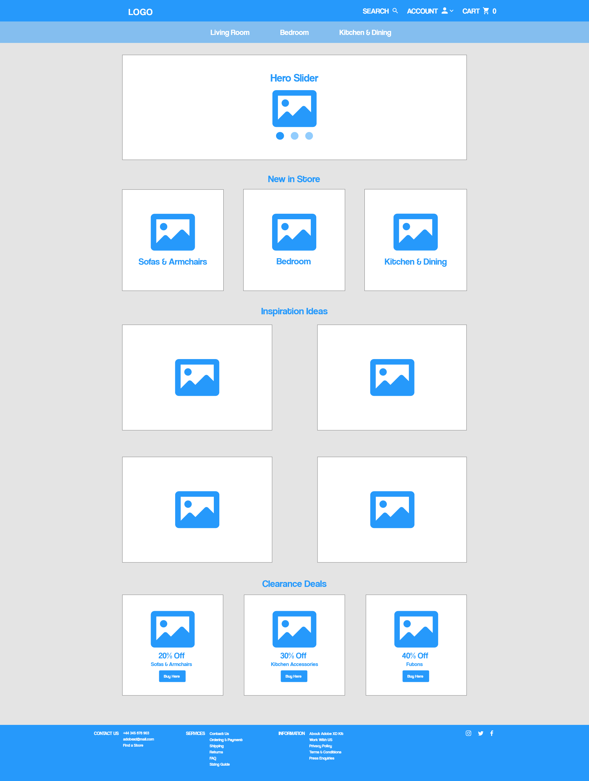
Mid-Fi Wireframe with Best Navbar
Test
A/B Test with Real Life User Profiles
After crafting a minimum of three draft versions for the requisite pages, I proceeded to conduct A/B testing with my Mom, asking her to interact with the prototype. My objective was to gauge which elements stood out to her and gather her impressions. Initially, she praised the navbar, appreciating its uncluttered design. However, her feedback became more insightful as she delved deeper into the prototype.
Regarding the homepage, contact page, and product detail page, she had relatively few comments. However, her feedback on the product listing page was particularly valuable. She suggested that the product titles should be positioned at the top of each product, prioritizing clear identification of the product names. According to her, this arrangement aided in remembering and distinguishing between products, especially when viewing the title above the product image.
Her insights extended to the filtering options, which surprised me. She preferred a sidebar approach over buttons with dropdown options at the top, primarily because it presented a more aesthetically pleasing appearance in her opinion. This preference likely stemmed from the sidebar's left alignment, which made it unobtrusive yet attention-grabbing due to its size.
Additionally, she recommended center-aligning the text and color options within the product listing. These observations constituted the bulk of the feedback I recorded during this A/B test session.
While I found some satisfaction in the initial round of testing, I believed it prudent to gather input from at least two more individuals. The challenge lay in finding people who perfectly matched the user profile, a task that proved somewhat elusive. Instead, I decided to enlist the feedback of a few female friends, recognizing that while they didn't precisely align with the specified age and income bracket, they could still provide valuable insights and a fresh perspective on the mockups.
I invited them to my apartment, where we sat down to review the prototypes. Their focus wasn't heavily drawn to the homepage, but they encountered some difficulty in understanding the buttons featured on it. I attributed this to potential improvements needed in the hero sliders positioned at the top and bottom of the page.
When we turned our attention to the product detail page, I presented them with three different search filter options and solicited their preferences. One friend favored the sidebar option, mirroring my Mom's choice, while the other preferred the button-style fixed sub-navbar. She appreciated the familiarity of top filters when searching for items on an e-commerce site. This valuable input helped resolve the filtering option dilemma, with the sidebar gaining a two-to-one preference ratio over the top filters.
Design
Creating the Mid-Fi Wireframes and Full Color Mockups
At the outset of the course, the curriculum didn't place a strong emphasis on low-fidelity, sketched wireframes for the pages we were tasked with designing. Instead, it encouraged an immediate dive into mid-fidelity wireframing using Adobe XD. While this approach familiarized me with the software, my typical workflow involves commencing with sketches before transitioning to design software.
After presenting my mid-fidelity wireframes to Shako, he recommended returning to the drawing board, suggesting I create at least three distinct navigation bars based on my research findings. Drawing inspiration from websites that offered clear and uncluttered navigation, I crafted three draft versions with a focus on functionality and user-friendliness, aiming to outperform the competition.
Following this, I selected one of the navigation bar drafts to proceed with, a choice that would carry through to the full-color mockup stage. The same process of generating three drafts extended to both the home page and the product listing page, ensuring a thorough exploration of design possibilities in the ensuing full-color mockups.
Navigation Bar
My primary objective throughout this project was to maintain a clean and uncluttered design, a departure from the recurring issues I identified in my research of other e-commerce websites. Many of these sites suffered from excessive complexity and often featured a centered search option. In response, I devised a solution centered around a hover-activated, right-aligned search bar.
To mitigate common clutter, I transformed the account link into a dropdown menu, encouraging users to create an account while still offering a favorites list option for guest users. However, the latter feature would only retain information if an account were created; otherwise, it would reset.
Additionally, I incorporated a cart icon and a sub-navigation menu featuring all the item categories available on the website, ensuring a well-organized and user-friendly interface.
Footer
I kept the footer intentionally simple and unobtrusive. It closely aligns with conventional designs since I received minimal feedback to prompt any significant deviations from the standard approach.
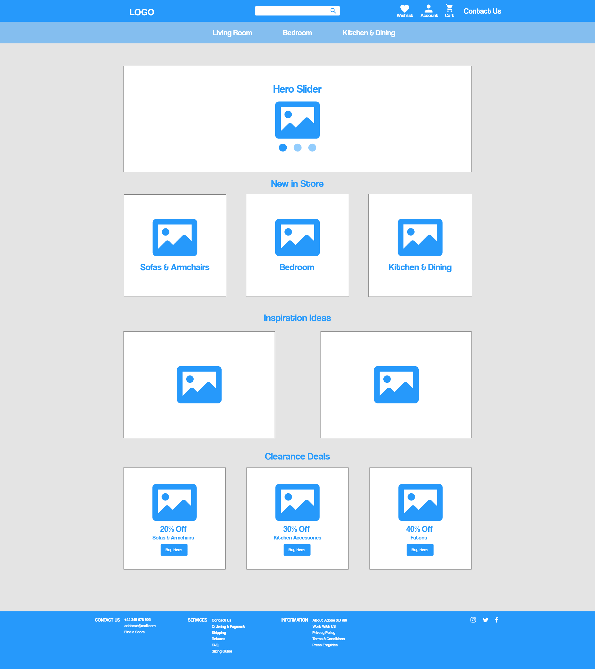
Home Page
The homepage incorporates the elements outlined in the brief, while also introducing a few additional sections to enhance the user experience. Beginning with the hero slider, I aimed for a clear and direct call to action, swiftly guiding users into a specific section of the website. Within this slider, a more detailed explanation of the living room essentials—such as sofas and armchairs—is provided, accompanied by a button directing users to the product listing page.
Immediately following the slider, the clearance deals section takes prominence, once again highlighting sofas and armchairs. Adjacent to this are the other clearance deals, each offering higher discounts. To optimize user scanning and readability, I adhered to the Gutenberg principle, ensuring a logical flow from the hero slider to the clearance deals.
This layout approach is reiterated in the middle of the page with a simple graphic, followed by a section showcasing new in-store arrivals. Finally, I included a social media section at the bottom of the page, featuring a Pinterest logo in accordance with our persona's preferences.
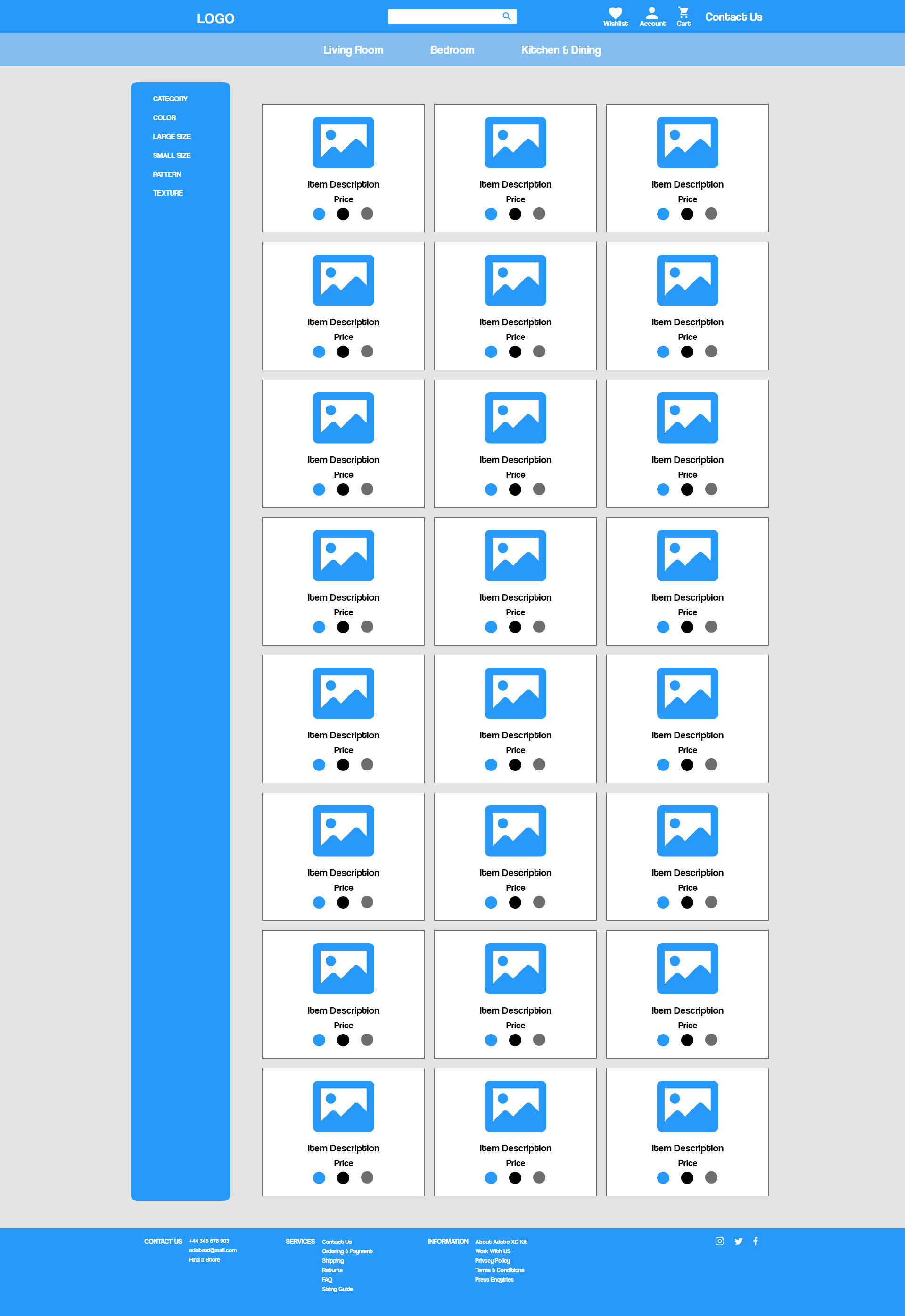
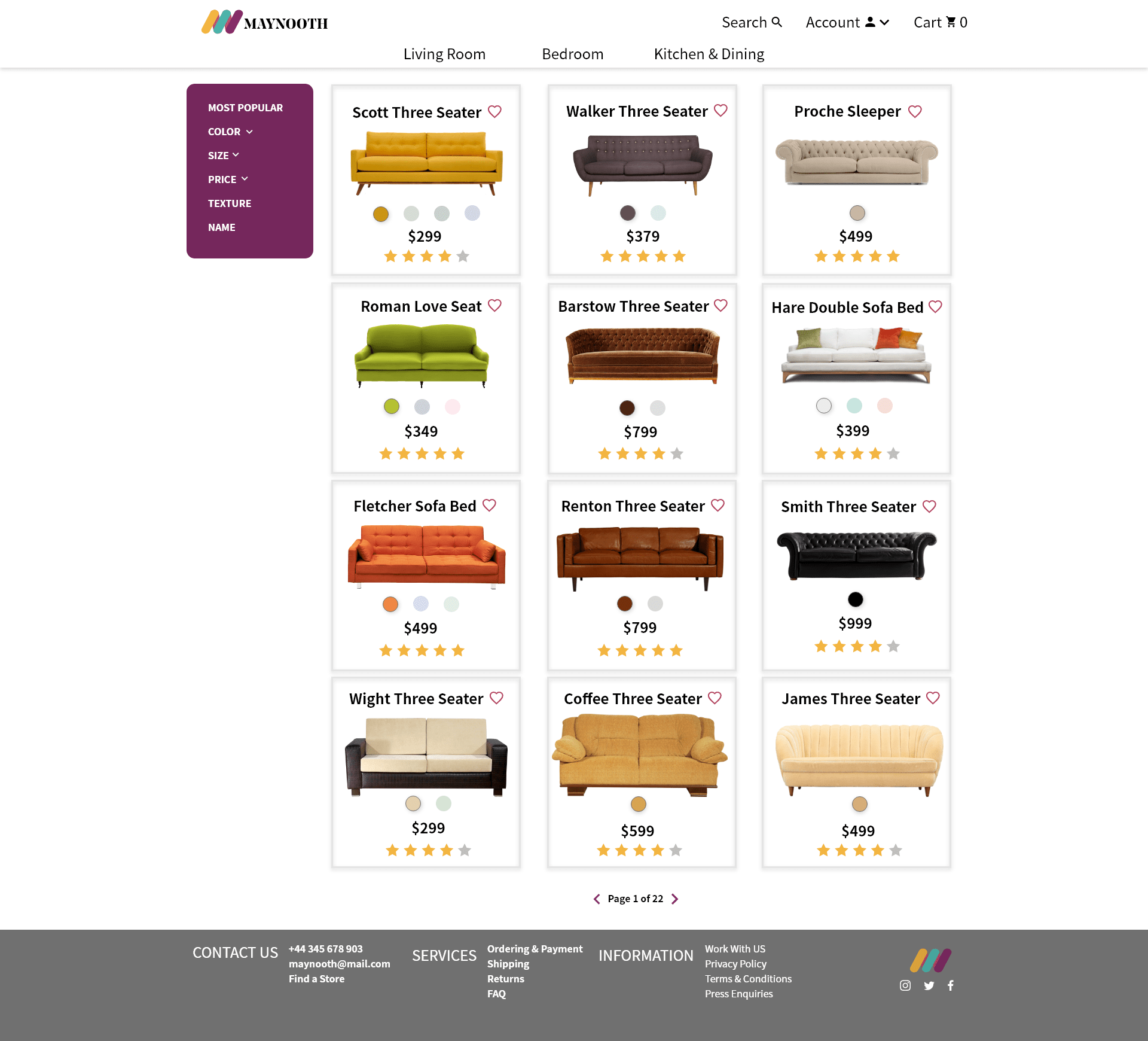
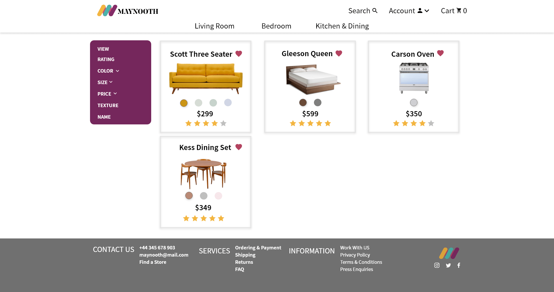
Product Listing Page
The feedback I garnered from the A/B testing process was predominantly centered around this particular page. In the initial drafts, I had incorporated multiple filtering options and experimented with various alignments for the text and product information. However, the most significant insights I gained from testing revolved around the preferred filtering option and the preferred layout for product information.
Product Listing Cards
The user's attention was initially drawn to the product images, but they indicated a preference for prioritizing the product titles over the price. Additionally, they encountered difficulty in distinguishing between the products due to the absence of clear boundaries in the initial drafts.
To address these concerns, I made several adjustments. I introduced a subtle box shadow around each product card to provide visual separation, and I positioned the product titles directly above the images, ensuring they were more prominently featured. Following the product image, I placed the color options ahead of the price, aligning with the user's emphasis on the product itself.
Furthermore, I incorporated a link to the product details page's review section at the bottom of each card through star ratings. In line with the user's inclination to create Pinterest boards, I also integrated a favorites option within each card to facilitate their personalized curation.
Filtering Options
The chosen filtering option for favorites was the sidebar, and while the initial reasoning was somewhat subjective – "just because I like it" – there's a strong indication that the Gutenberg principle played a role in this decision as well. The left-aligned placement of the sidebar not only appealed to the user aesthetically but also adhered to principles of readability and familiarity.
To enhance the user experience, I implemented a fixed position for the sidebar, ensuring it remained visible while scrolling through the products. Additionally, I maintained a product listing layout with three items per row to provide an optimal view of the products, making it easier for the user to explore and engage with their favorite selections.
Favorites Page
Incorporating a favorites option was a logical step, given the prevalence of wish lists on most e-commerce websites. I aimed to emulate the technical functionality of websites like Asos while maintaining a distinct aesthetic approach. Asos' simple and user-friendly system served as a source of inspiration, with a heart icon allowing users to add items to their wish list by simply clicking on it, causing the icon to fill.
The wish list page closely resembled the product details page but with some variations in filtering options to align with the user's preferences. To enhance the user's experience and cater to their penchant for Pinterest boards, I introduced an alternate view for the favorites list. This view utilized alternate product images available from the product details page and presented them in a tile-style layout, offering a visually appealing and user-centric option for managing and curating their favorite items.
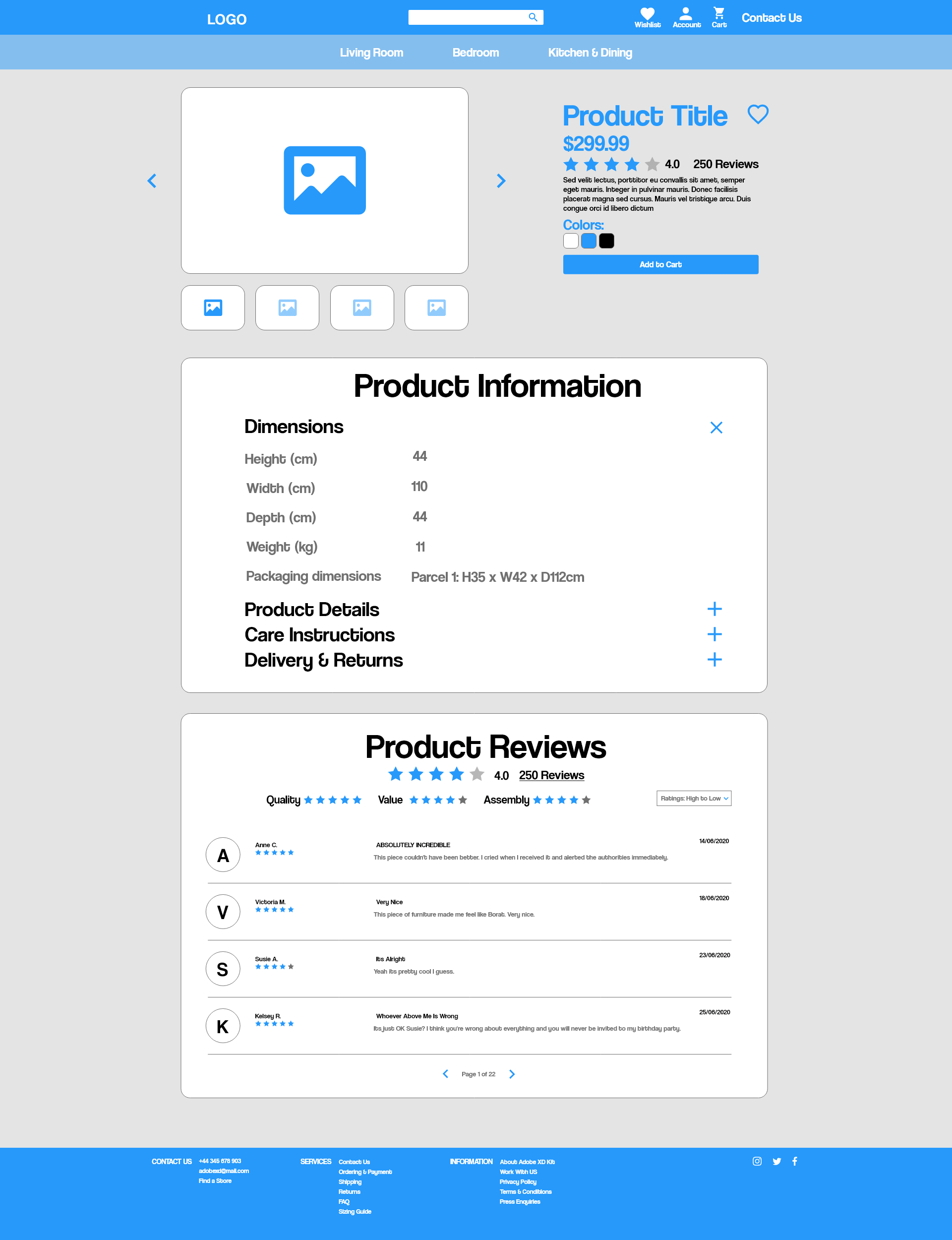
Product Details Page
The initial section of this page features a dynamic hero slider showcasing alternate product images, with the primary product information situated to the right. Notably, the product title and price command the most prominent positions within this column. Immediately following, there's an anchor link directing users to the reviews section located further down the page. This design choice was influenced by both testing and research findings, indicating that users landing on this page typically seek comprehensive information about the item.
The strategic placement of the anchor link leads users to the bottom of the page, where they must scroll upward past the product details section, which includes collapsible portions. This intentional layout encourages users to gather information before adding the item to their cart, fostering a more informed purchase decision. Additionally, I envisioned incorporating some lighthearted and comical reviews into this section to engage users further.
Beyond the reviews anchor, there's a brief placeholder text in lorem ipsum, followed by the presentation of color options and an "add to cart" button, completing the user journey through this section.
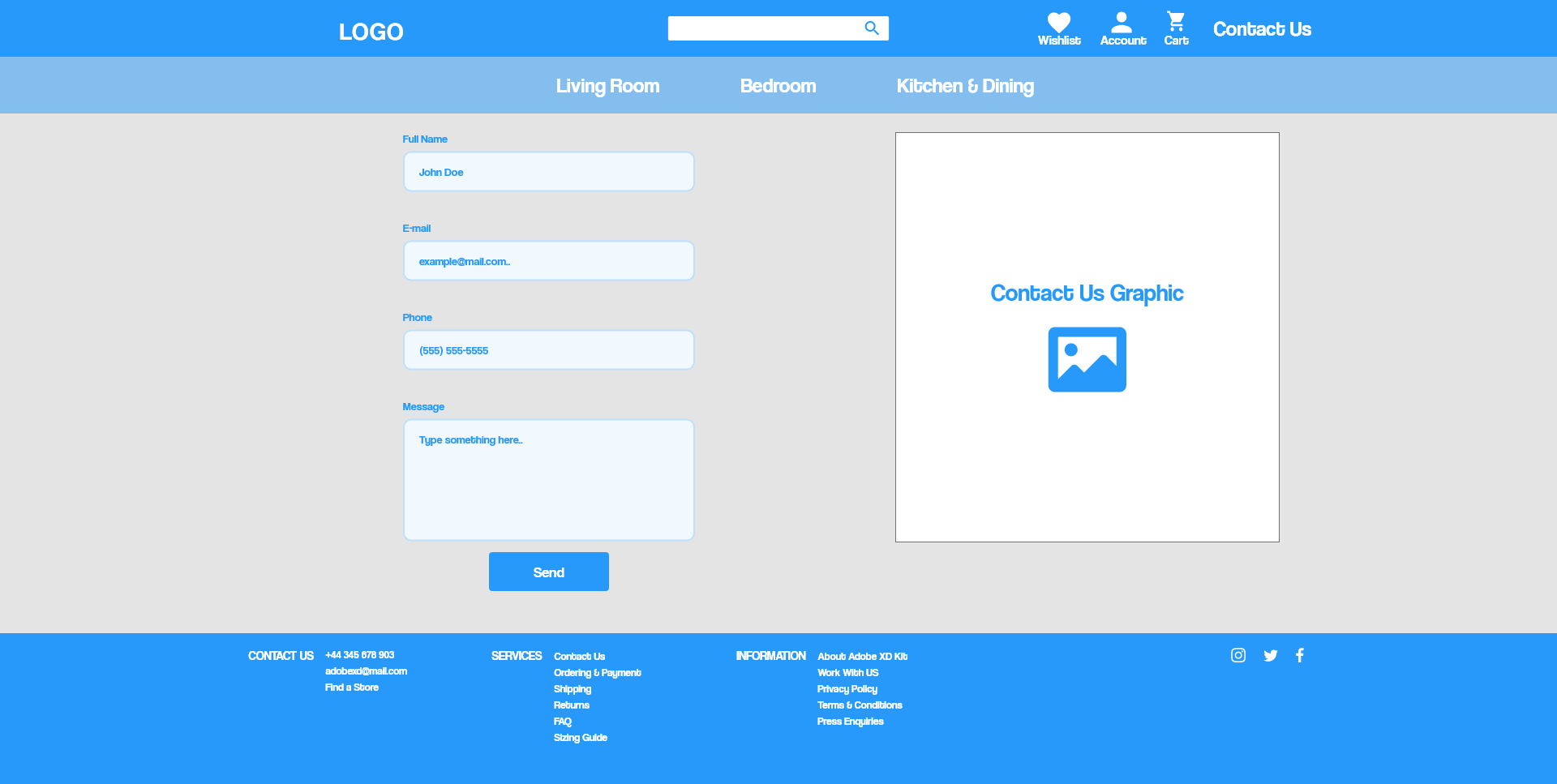
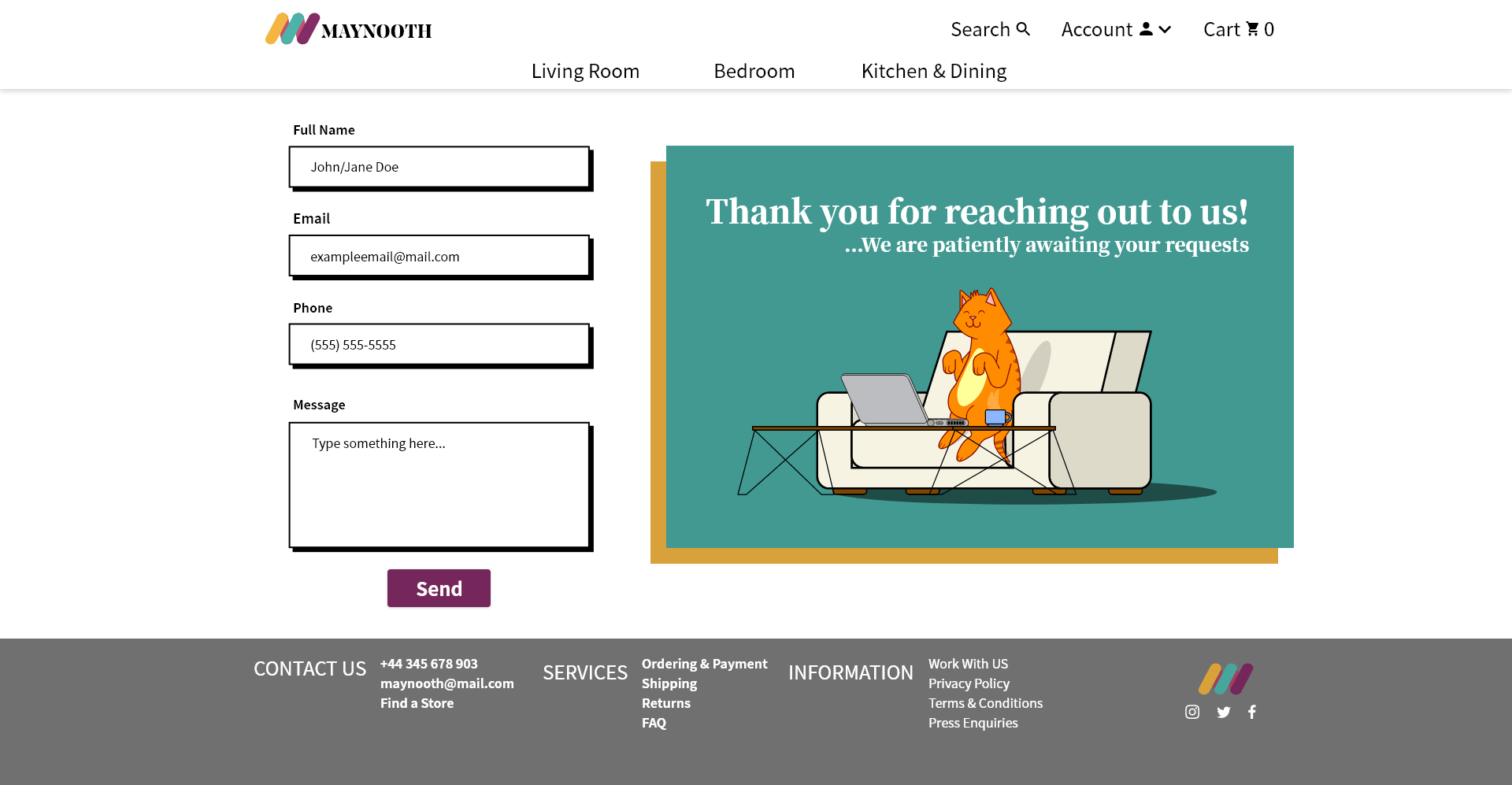
Contact Page
I chose to implement a separate contact page rather than opting for a contact form modal that overlays the home page because, after extensive testing, I concluded that this approach would be more effective. While my user profile brief didn't explicitly specify a preference, I took into account the psychography of the individuals I tested with and found that a separate page was the optimal choice.
The separate page design not only simplifies the user experience but also reduces the risk of overwhelming users with multiple elements on the same screen. It provides a sense of familiarity, allowing users to clearly see the header and footer, which aids in navigation and provides a more comfortable interface for inputting information.
To infuse a touch of style and eliminate white space on the page, I introduced a cat graphic, enhancing the visual appeal of the contact page while maintaining a clean and organized layout.
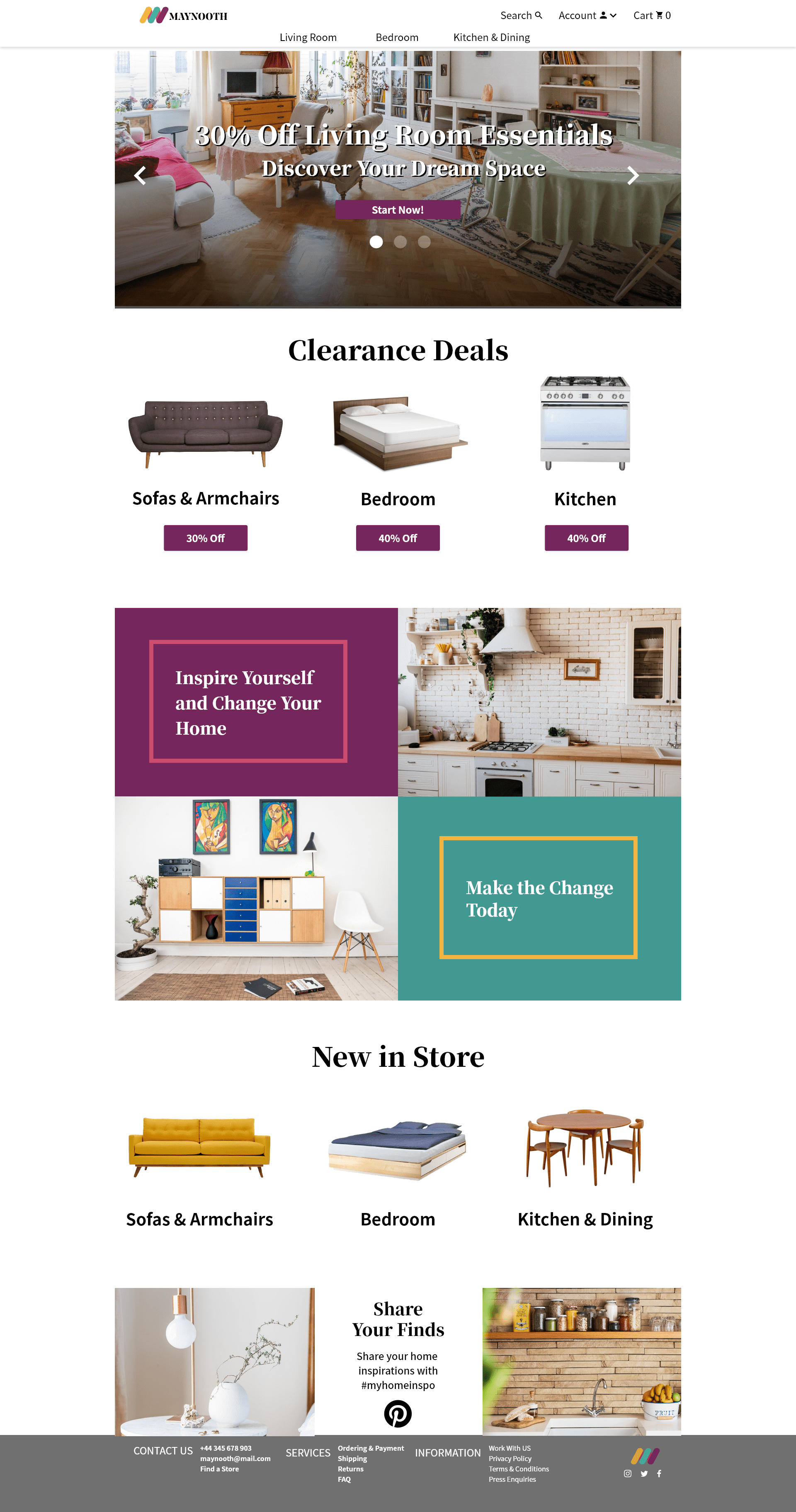
Homepage
Product Listing Page Wireframe
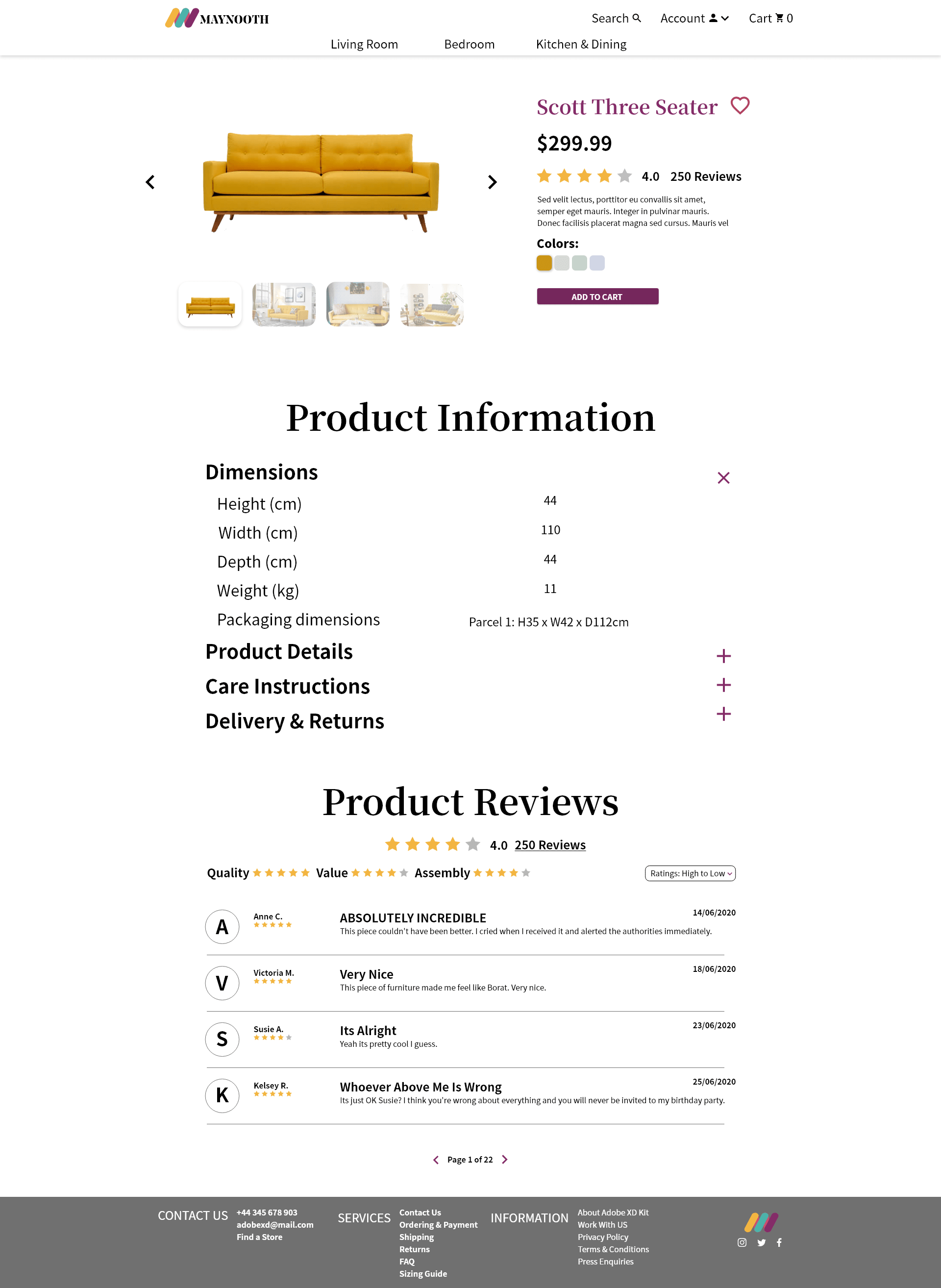
Product Details Page
Contact Form Page
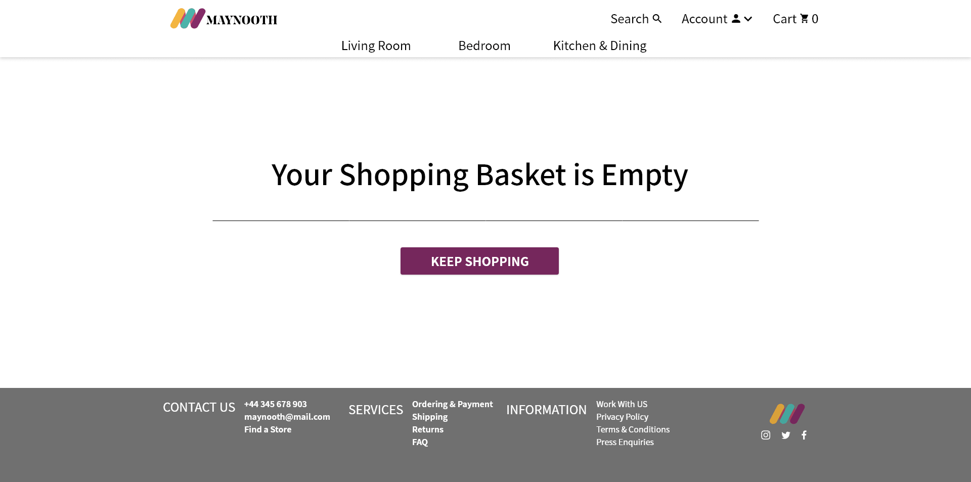
Shopping Cart Empty
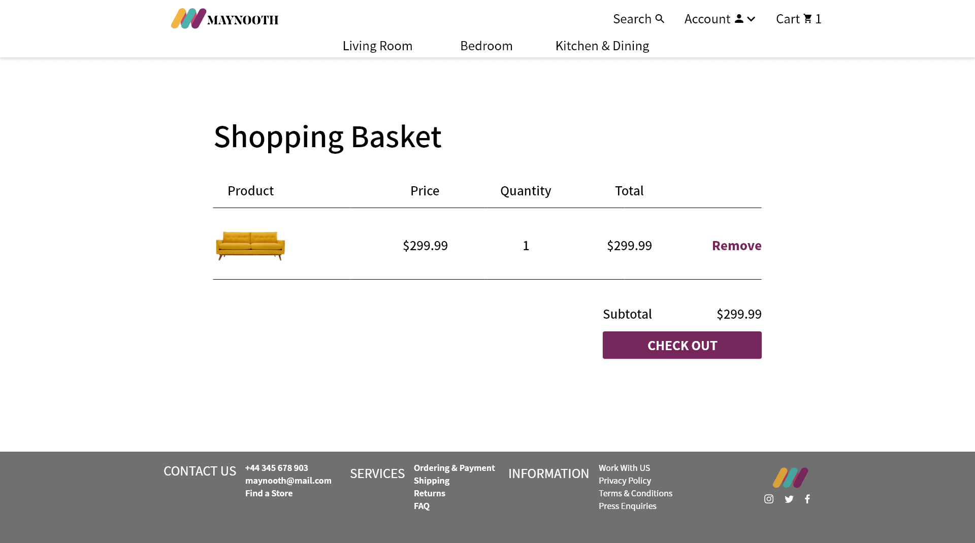
Shopping Cart with Item
Favorites List Regular View
Favorites List with Tile View
Prototype
Header
Commencing with the logo, I ensured it served as a consistent home link across all pages, facilitating seamless navigation. On the opposite side of the main navigation, I incorporated a hover-activated search option, offering users quick access to search functionality. Adjacent to this, I included a link to the account onboarding page, presented as a dropdown menu, which also provides direct links to the contact and favorites wish list pages.
In the final segment of the navigation bar, users find a link to the shopping cart and checkout page, streamlining the path to the purchasing process. Beyond the main navigation, the secondary navigation links guide users toward the product listing pages, ensuring a logical and intuitive browsing experience.
Footer
The footer contains several inactive links, rendering most of its sections non-functional. The sole active link within this section is the one represented by the Maynooth logo on the right side, which directs users back to the homepage.
Product Listing Page
This page features just a single link. Clicking on the first product will navigate the user to the Product Details Page.
Product Listing Page, Favorites Wishlist Pages, and Cart Checkout Pages
The remaining two pages lack internal links to other content on the pages themselves. The only accessible links are those elucidated in the header and footer sections mentioned previously.
Conclusion
Final Thoughts
In conclusion, I am confident that I fulfilled all the project requirements outlined in the course. I meticulously incorporated every element specified for each page, ensuring comprehensive coverage of all criteria. Furthermore, I took the initiative to expand the project by including additional pages, enriching the overall depth and scope of the final deliverables.
Positives
This project has brought several valuable benefits into focus. Firstly, it significantly enhanced my comprehension of the UX process, equipping me with a deeper understanding of how to effectively utilize Adobe XD and craft UI design mockups that I can proudly showcase in my portfolio. Beyond these technical skills, perhaps the most noteworthy aspect of this endeavor has been its capacity to ignite my enthusiasm for further exploration within this field. The project instilled in me a desire for continuous learning and improvement, prompting me to delve into research and learn from my missteps, all within a low-risk environment that allowed me to experiment and push the boundaries of my capabilities with these essential tools.
Growth Points
Within the scope of this specific project, I've identified areas where I could have made improvements, particularly in the realms of prototyping and testing. Testing, in particular, stands out as the more critical and somewhat uncontrollable aspect of the project. While I acknowledge the significance of several omitted elements within the broader UX process, such as one-on-one collaboration with both users and developers, I was aware that this course would not comprehensively cover every facet.
I conducted testing with just three individuals, primarily due to the challenges of garnering feedback amid the global pandemic that unfolded in 2020 when I initiated this project. Although I aspired to meet the conventional benchmark of testing with five users, I fell slightly short. In a more extensive and mature project, I would undoubtedly strive to attain that goal.
Regarding prototyping, my focus leaned more towards static designs rather than dynamic elements. In hindsight, I recognize that incorporating animations, such as a collapsible feature for the filter sidebar on the Product Listing Page, could have enhanced the overall user experience.
While I maintain a degree of contentment with the design outcome, I aspire to engage in projects that push design boundaries and cater to younger user profiles. It's important to acknowledge that there's always room for improvement and the potential to elevate every design. However, I am confident that the product I delivered effectively meets the user's needs for an e-commerce website.